Four Ways To Convert Your Color Photos To Black & White Using Photoshop
B&W - MONOCHROME - MONO - GRAYSCALE
These are all terms that describe the same thing – Black and White pictures. Digital photography has ushered Black and White photography back into mainstream use.Everyone loves black and white pictures, but the introduction of cheap color film processing and printing had caused it to all but die out. Now, thanks to digital technology, not only is it making a comeback, but anyone with a computer can do it easily, cheaply, but more importantly anyone can have fun with it.
Perhaps, though, you may be a little unsure of the best way to convert your pictures. Or maybe, you’ve tried converting your pictures but aren’t happy with the results you’ve got.
Well never fear. We are about to start you off on the road to fantastic monochrome imagery.
 |
 |
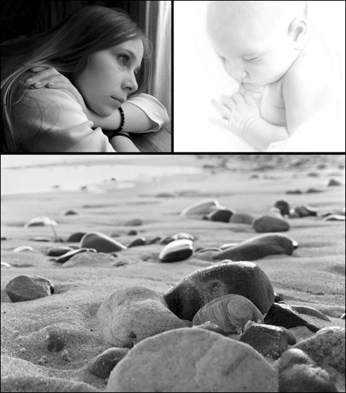
B&W images can often convey more feeling and atmosphere in them than their color cousin. Deep shadows can add drama, frame a subject, bring out texture or help a subject stand out in the picture.
Soft grey hues can add a mood of serenity, sorrow, calm, peacefulness, loss or countless other emotions to your picture. Sometimes, removing the color from an image lets the viewer concentrate on what is happening in the frame, getting the maximum impact out of the image’s narrative.
So how do you know what picture will look good when it’s converted from color to B&W? Should you take the picture in B&W on the camera? What kind of conditions make for a good B&W subject?
Look At The Tones
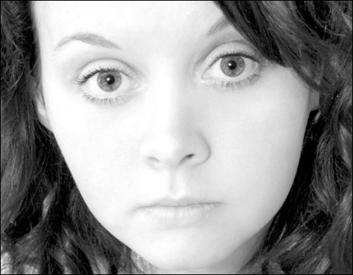
Not all color images will look good in B&W. Why? It’s because once you remove the color information from a picture, the only thing you have left of the color tones are shades of grey, and many colors have a similar grey tone.This results in your picture looking very grey and flat (not much difference in the contrast between white and black), and ultimately, without the color highlights, very uninteresting.
 |
This is why it’s not really a good idea to take the actual picture using the B&W mode on your camera. The better plan is to shoot everything in color and if you want to experiment with it in B&W, take the color out yourself.
It’s easy to convert pictures from color to B&W. You CANNOT put the color back in if you shoot in B&W mode on your compact camera. So what should you look for?
Trying to see how something will appear in B&W before you shot doesn’t come naturally to us because we see in color. As you gain experience and see your results, this skill will develop, but to begin with, here are a few guidelines to increase your success and confidence.
To begin with, you are looking for subjects that have good strong contrast in them (good shadow and highlight detail appear naturally when you take a picture in sunlight). Strong contrast gives a good punchy B&W effect.
Look For Interesting Texture
Something that JUMPS out of a B&W picture is TEXTURE. To really see the texture in something, you need shadows across the surface. This means that the light hitting the subject should come from the side of the subject and not the front.This creates little shadows and highlight detail that enhances and defines the look of the texture. Texture is all around us - in natural surfaces, such as tree bark, stone, the surface of water and in such natural features like stormy skies.
Man-made texture is by no means difficult to come across. It is everywhere in the cities - buildings and architecture, such as churches, railings, brick walls and fencing, towers and windows and bridges. The list is almost endless.
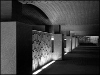 |
 |
Strongly patterned brick work, geometric form and motifs, combined with low directional lighting turn this covered walkway into a visual feast for the eyes.
Once converted to B&W, the distracting color tones are removed and the image changes from a building to an abstract art form.
Contrast Makes The Difference
Another good rule of thumb for getting excellent results with a B&W conversion is good contrast – so deep shadows or extreme bright highlights.B&W pictures really work well where the subject doesn’t have to compete against a background that contain lots of confusing overlapping elements, so for example if the background is deep shadow, the subject can really be framed.
You can always go the other way, and use brightness to create a high contrast in the picture by removing some of the pictures mid-tones, either deliberately, by over exposing the picture, or by adjusting the picture on the computer using Levels or Brightness & Contract commands.
 |
Contrast is essential to give a successful B&W conversion - you can take it to the extremes and make it very harsh or very subtle. But however much contrast you use, make sure that your image looks balanced and does not look flat or dull.
 |
Shapes And Patterns
Look for shapes and patterns in sculptural things and in structures like buildings, bridges, architecture, trees, shadows and reflections. They can look so different once you have stripped away the colour to reveal the beauty hidden inside.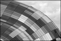 |
 |
Once you have an image you want to play around with, it’s always best to copy it and experiment on the copy file. That way, you won’t lose anything if you go too far.
There are many ways to convert a color image into black and white picture. There is no single right way. It all depends on what result you prefer. Open the file that you want to convert into B&W and you’re ready to start.
Let's Get Started With Photoshop
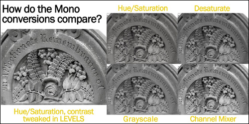
To help you decide which mono conversion method is right for you, here are 4 of the easiest methods for you to try. There are no right or wrong ways. You should see which one you are most comfortable using and which one produces the results you are happiest with.Method 1 - Hue & Saturation
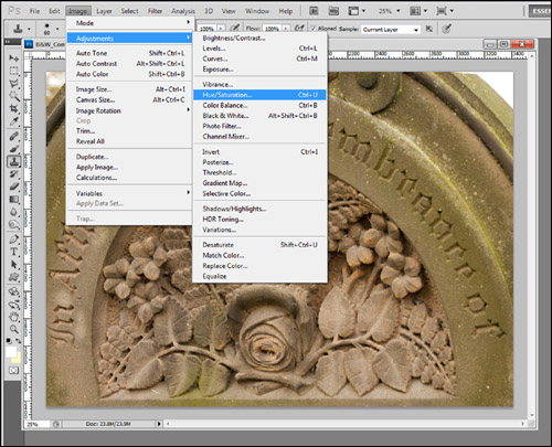 |
Select IMAGE from the menu bar, then ADJUSTMENTS from the drop down menu, then HUE/SATURATION from the second drop down.
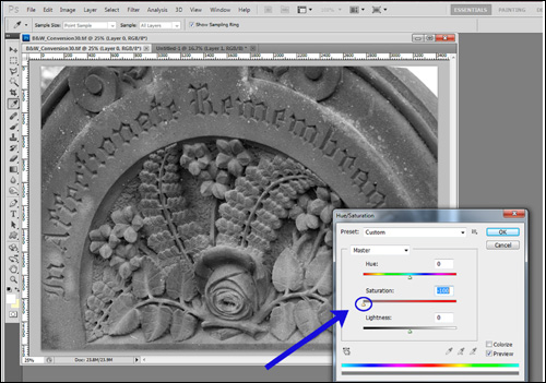 |
Click on and drag the SATURATION slider all the way to the left to remove all the color from the image.
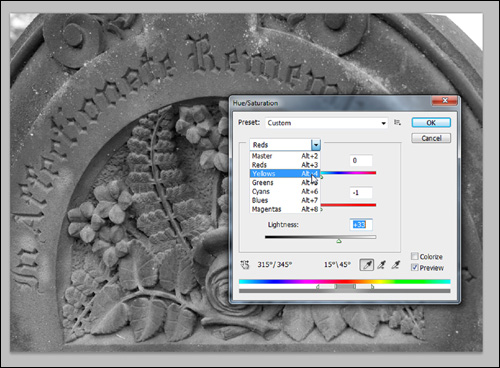 |
Click on the MASTER drop down. You will be able to select each of the 6 color channels and fine tune the contrast until you are happy with the look of your image.
Method 2 - Desaturate
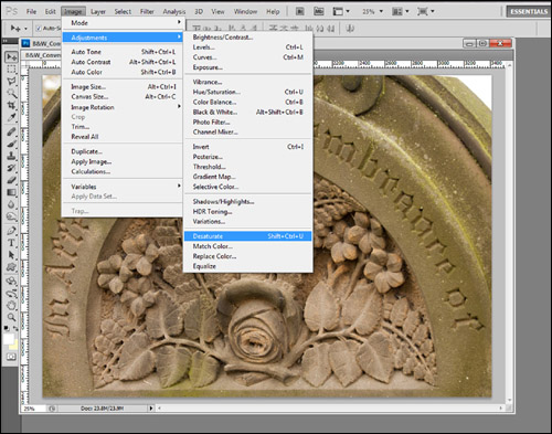 |
Select IMAGE from the menu bar, then ADJUSTMENTS from the drop down menu, then click DESATURATE from the second drop down.
 |
The color is removed out of the image according to pre-set conditions. (That means Photoshop removes the color the same way for every image, regardless of what colors are there.)
Desaturate literally takes the color information out of the image, no more no less. If the image lacks contrast in the color version, there will be no contrast in the B&W conversion.
You will have to add it back in at the end, which is covered at the end of the article with LEVELS.
Method 3 - Change The Color Space
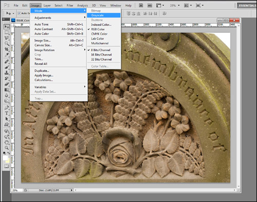 |
Select IMAGE from the menu bar, then MODE from the drop down menu, then GRAYSCALE from the second drop down.
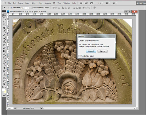 |
A small pop up will appear, asking if you wish to discard (remove) the color information from the picture. Click ‘DISCARD’.
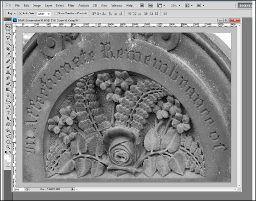 |
The image will turn B&W. From now on, it will only appear and print in shades of grey. It will not support any color elements. Again, lack of contrast must be added by LEVELS or CURVES adjustments.
Method 4 - Channel Mixer
The Channel Mixer is a slightly more complex operation to convert the image into B&W, but you can better control the spread of tones to give you more contrast and a better balance of tones in your B&W conversion.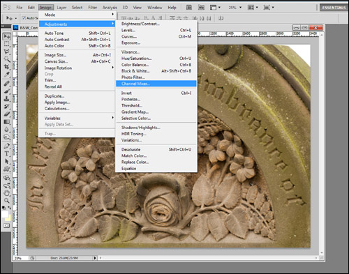 |
Select IMAGE from the menu bar, then ADJUSTMENTS from the drop down menu, then CHANNEL MIXER from the second drop down.
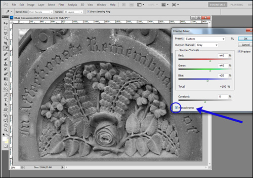 |
Tick the ‘MONOCHROME’ box in the bottom left corner of the pop-up. Ticking this box turns the image B&W, but you can now begin to make finer adjustments.
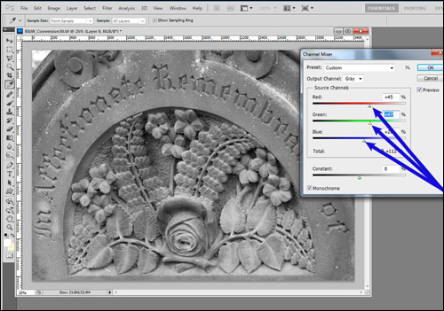 |
Using each color slider in turn, click on and drag the slider in either direction. The tonal quality of the image will change as you do so. Hit ‘OK’ when you are happy with the look of the image.
Final Adjustments Using Levels
Depending on the method you have used to convert your image into B&W, you may feel that you want a little more contrast in the final image to give it a bit of punch and mood. A quick way to add contrast is with LEVELS.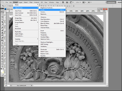 |
Select IMAGE from the menu bar, then ADJUSTMENTS from the drop down menu, then click LEVELS from the second drop down.
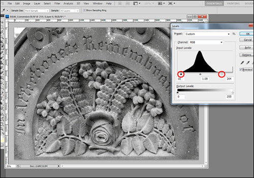 |
Drag the Black Tone and White Tone Sliders (small black and white triangles) in toward the centre, until each begins to touch the black line of the Histogram graph. You can adjust it visually too, to make sure you get the right amount of contrast.
Hit ‘save as’, rename it and you’re all done!
 |
| Didn't find what you're looking for? Search here... |

Custom Search
|
Return from Black And White Conversion to Digital Photography Tricks

[?] Subscribe To This Site


Sponsored Ads
Recommended Reading
 |
Sponsored Links
David Coote
Wedding Photographer
Northern Ireland